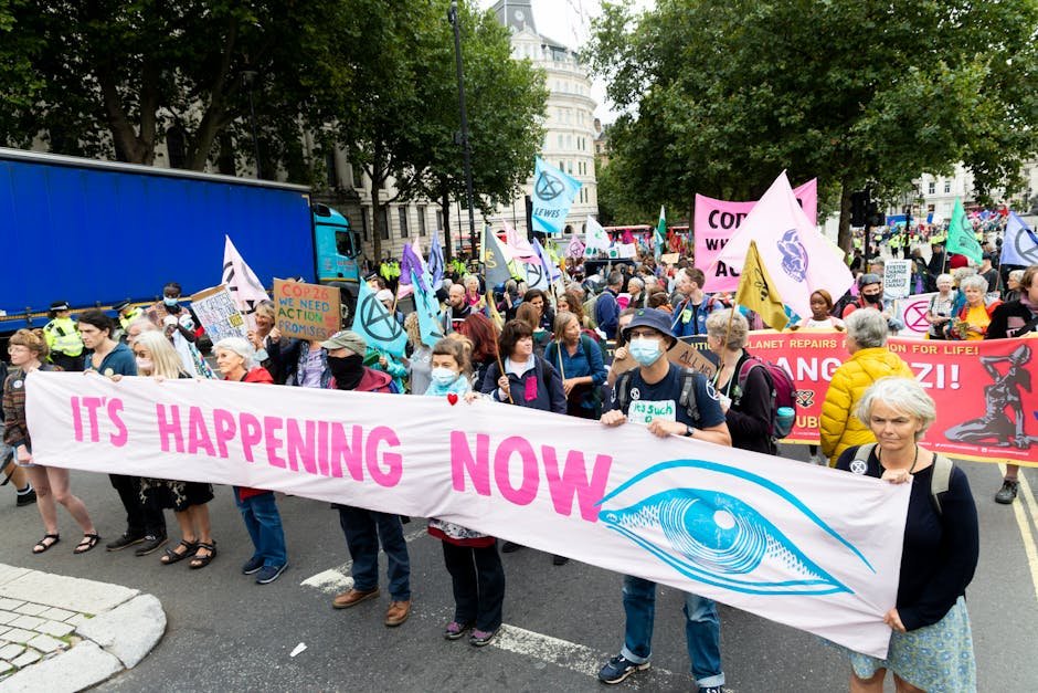
Banner Design Tips for Maximum Impact at Community Events
In the bustling atmosphere of community events, banner design plays a crucial role in capturing attention and relaying messages effectively. From colors to fonts to call-to-action elements, every aspect contributes to the overall impact of a banner. Let's delve into some valuable tips to create eye-catching banners that stand out from the crowd.
Crafting Eye-Catching Banners That Stand Out
When it comes to banner design, the first step is to understand the purpose of your banner. Are you aiming to promote an event, attract customers to a booth, or convey important information? Clarifying this upfront will guide your design choices and ensure that your banner serves its intended function effectively.
Visual impact is key in a crowded event space. Utilize bold colors and compelling imagery to grab attention from a distance. Remember, your banner needs to be seen amidst a sea of distractions, so make sure it stands out without being overwhelming.
Keep your message clear and concise. Avoid cluttering your banner with too much text; instead, focus on a brief, impactful message that conveys the essential information. Use large, easy-to-read fonts to ensure readability, even from a distance.
Consider the placement of your banner. Position it at eye level for maximum visibility, and ensure that it is unobstructed by other elements. A well-placed banner can draw in attendees and direct traffic effectively.
Incorporate elements of branding to maintain consistency with your overall visual identity. Use your logo, brand colors, and any relevant imagery that aligns with your brand story. Cohesiveness across all your marketing materials reinforces brand recognition.
Choosing the Right Colors and Fonts for Your Banners
Color psychology plays a significant role in banner design. Different colors evoke varying emotions and responses in viewers. Choose colors that not only align with your brand but also resonate with your target audience. Whether you opt for bold and vibrant hues or subtle tones, ensure they communicate the desired message effectively.
Font selection is equally important. Fonts should be legible, even from a distance, and reflect the tone of your message. Avoid overly ornate or complicated fonts that may hinder readability. Opt for a clean, modern font that complements your overall design aesthetic.
Contrast is key to ensuring your message stands out. Select colors and fonts that create a strong contrast to enhance readability. A well-executed contrast will draw attention to the most critical elements of your banner, making them easily noticeable and impactful.
Designing Effective Call-to-Action Banners
A compelling call-to-action (CTA) is essential for banner design at community events. Clearly communicate what action you want viewers to take, whether it's visiting your booth, signing up for a service, or making a purchase. Use action-oriented language that motivates immediate response.
Create a sense of urgency in your CTA to prompt quick engagement. Phrases like 'Limited Time Offer' or 'Join Now' can nudge viewers towards taking the desired action promptly. Make sure the CTA stands out visually and is placed prominently on the banner.
Provide clear contact information or next steps for interested individuals to follow. Whether it's a website link, a QR code, or a phone number, ensure that viewers know how to take the next step after seeing your banner. Make it easy for them to connect with your business or organization.
Banner design at community events is more than just visual appeal; it's about conveying the right message to the right audience. By integrating these design tips, you can ensure that your banners leave a lasting impression and drive engagement effectively.

